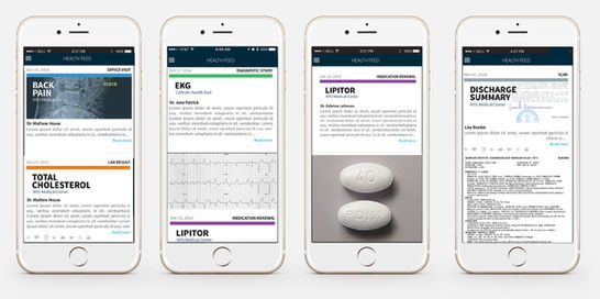
Redesign of Patient Portal
Patient Portal Design | Creative Direction
This project was a company-wide initiative to come with a patient portal solution both for desktop/laptop and for mobile that would not leave our client base and their patients confused on which portal to use, along with revamping the entire product. The end result was rated #3 of Best in KLAS (designation given to a healthcare technology and service company ranked by healthcare providers).
Challenge
This was initially a very complex challenge for several main reasons. Through acquisitions the company had made, we had at one time a total of two Patient Portals. Internally, each product team thought that their solution was the one to move forward with. Additionally, one of the products had a mobile component to them.
Role & Responsibility
With this project, I began meeting with executives to define/refine overarching strategic direction. From that, I was able to meet with Product and Engineering leadership to begin creating strawman KPI's and get all of the problems we were aware of out on the table. From these meetings and activities, I was able to allocate the right User Researcher(s), Product Designer(s) and eventually Visual Designer(s) to the projects. Additionally, I was able to track progress in several ways: 1:1's with each member of the UX Team, meetings with Product and Engineering Leadership, Slack channels, etc.
